This year, NASA marked the 60th anniversary of its establishment as a U.S. government agency. Let’s see what we can uncover about the past 60 years through data visualization!
I wanted to try to challenge myself with a quick and exciting data visualization projects. To do so, I took on this month’s DataViz Battle put on by the subreddit r/dataisbeautiful. In DataViz Battle challenges, a dataset is supplied, and it is up to the individual to come up with and create interesting and informative data visualizations.
This month, the dataset contained NASA astronaut data, both current and former, along with stats about them for things such as: _- gender _- number of flights flown _- selection year into the program _- time spent in space _- military or civilian background
Collect Data and Cleaning
I loaded the CSV into a Jupyter Notebook, and did an initial inspection of the data types, which returned the following:
Astronaut                                object
Selection Year                            int64
 Group                                    int64
 # Flights                               object
Status                                   object
Military or civilian                     object
Gender                                   object
If military include details              object
Date of birth                            object
Job                                      object
Missions flown                           object
Cumulative hours of space flight time    object
My first impressions are that there will at least have to be some clean up to the column names to make them functional by trimming extra spaces and shorting some of the names.
After that, what I expected to be numeric values for Number of Flights and Hours in Space needed to be converted to integers from string and account for some of the null values present.
Finally, I cleaned up categorial columns I wanted to use by removing extra spaces and filling in null values based on research to make the data useful for grouping and finding trends.
Feature Creation
Additionally, I used the year from Date of birth along with Selection Year to make a new data column called Age, which refers to the age of the Astronaut at the time of their selection into the program.
Explore The Data
For me, the best part of data visualization is about what you can uncover from the data by visualizing groups and allowing the scale to tell a story. I wanted not only to create some visually appealing graphs but see what we can learn from the data outside of the table format!
Gender Selection across Space program
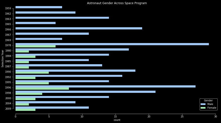
Women were not selected as part of the astronaut program until 1978
The 1978 group included notable astronauts Sally Ride (first American woman in space), Shannon Lucid (held longest duration stay in space by an American), Anna Lee Fisher (first mother in space), and Judith Resnik (aboard Challenger mission).
Women have never exceeded or meet 50% of a selection groups total. Come on NASA!
Chartify side note
I really wanted the chart above to be a stacked bar chart, but that requires creating a total column in Seaborn and then stacking two plots on top of each other to create this layout. Rather than battle formatting on this task, I wanted to see if Chartify would be better at producing the graph I wanted.
And it was successful!
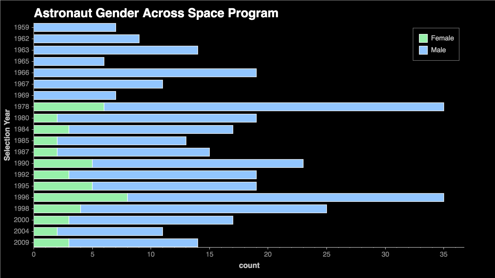
There was one additional step to make a dataframe that was the count totals I needed rather than allowing the platform to build it on its own. Here is a snapshot of the code that made the above chart:
# Create data summary to plot
quantify_by_gender = df_astro.groupby(['Selection Year','Gender'])['Astronaut'].count().reset_index()

# Plot the data
ch = chartify.Chart(blank_labels=True,y_axis_type='categorical')
ch.set_title("Astronaut Gender Across Space Program")

ch.style.set_color_palette('categorical', palette='custom palette') # Custom palette to mimic Seaborn dark grid
ch.plot.bar_stacked(
         data_frame=quantify_by_gender,
         categorical_columns=['Selection Year'],
         numeric_column='Astronaut',
         stack_column='Gender',
         normalize=False,
        categorical_order_by='labels'
)
There were several additional lines of code needed to recreate the format to match what I wanted that graphs to look like. In the end, I decided to stick with Seaborn for this project, but Chartify can be useful for my future projects when I would like to stick with there built-in styles.
Age Distribution
After creating the Age feature, I wanted to see how best to include this into other groupings to reveal some fascinating insight into the data.
Age By Status
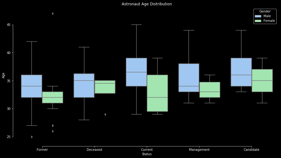
From this plot, I found the outlier in the ‘Former, Female’ grouping of particular interest. WHO IS THE OUTLIER THAT BECAME AN ASTRONAUT AT 47?!
After exploring the data using Pandas, I was able to locate the astronaut I was interested in discovering!
Astronaut                      Morgan, Barbara R.
Selection Year                                1998
Group                                           17
# Flights                                        1
Status                                      Former
Military or civilian                      Civilian
Gender                                      Female
If military include details                    NaN
Date of birth                           11/28/1951
Job                             Mission Specialist
Missions flown                             STS-118
Hr in Space                                    305
Birht Year                                    1951
Age                                             47
Name: 298, dtype: object
Since Barbara Morgan was the oldest to join the astronaut program, I wanted to know her journey in becoming an astronaut at an older age. So I read into Barbara’s Wikipedia page and was not disappointed in learning her journey!
Barbara Morgan, a school teacher, was the backup to Christa McAuliffe as part of the Teachers in Space Project back in 1985. McAuliffe was part of the crew for the ill-fated Space Shuttle Challenger mission in 1986.
Morgan was finally selected in 1998 and flew on the STS-118 Mission.
Age By Selection Year
Additionally, I wanted to see how the age of the selection group has changed over time, if at all. A ridge plot should be a useful tool in doing so.
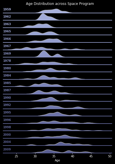
The average age of an astronaut across all Selection Groups was 34.5 years old
The distribution of astronauts appears to have gotten older over time with very few candidates being younger than 30.
We know that Selection Groups before 1978 were mostly smaller than average 16 astronauts in each class. This can account for the distributions with less variance.
Astronaut Selection
Next, let’s explore what the path to becoming an astronaut looks like. To do so, I used a Sankey diagram to show this process.

- The current pool of astronauts is close to split between military and civilian backgrounds evenly.
- The military path to NASA is dominated by 188 men, but there are 13 women who have become astronauts from our armed services.
Those 13 women service members are:
[['Collins, Eileen M. ', 1990],
['Currie, Nancy J. ', 1990],
['Helms, Susan J. ', 1990],
['Coleman, Catherine G. ', 1992],
['Lawrence, Wendy B. ', 1992],
['Hire, Kathryn P. ', 1995],
['Kilrain, Susan L. ', 1995],
['Melroy, Pamela A. ', 1995],
['Cagle, Yvonne D. ', 1996],
['Clark, Laurel B. ', 1996],
['Nowak, Lisa M. ', 1996],
['Stefanyshyn-Piper, Heidemarie M. ', 1996],
['Williams, Sunita L.', 1998]]
Time in Space
Now for the most exciting category, how long each astronaut has spent in space. Let’s see what we can find.
Time in Space By Selection Year
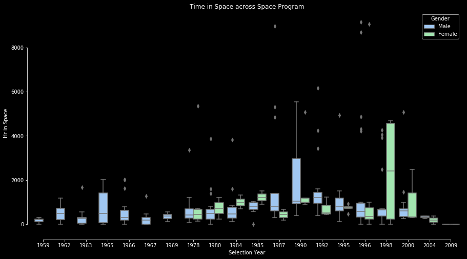
As expected, the early years of the space program had astronauts with relatively shorter times spent in space, but this was marked by the Apollo Program and missions to the Moon rather than orbits associated with the Space Station program that was later to come.
I was also interested in the astronaut from who appears to have been an early pioneer in length of time spent in space from the 1978 Selection Group. Here is what I found:
- Shannon Lucid was part of the first selection group that included females in 1978. One of her many achievements includes her fifth spaceflight in 1996 when she spent 188 days in space.
- Shannon Lucid later served as the Chief Scientist of NASA.
Time in Space By Service
I was also curious to see if military service members or civilians spent more time in space. My initial assumption is that military background would be more dominant in this area due to prior experience and also being the slight majority in astronaut background.
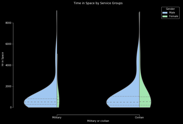
Interestingly, more civilians appear to have spent longer time periods in space than service members, which I believe can be attributed to the nature of most civilian roles being based on scientific exploration during flight missions.
Comparison of Time in Space for all astronauts
Finally, I couldn’t resist but include an interactive chart that was visually appealing and included the data for anyone to explore. I chose to use a sunburst chart sorted by year and time in space to make something that can effectively use the space but also maintain the space theme.
The sunburst chart only contains astronauts that spent time in space.
Inspiration
When I think of space and graphs, my first visual is the control panel of the Space Shuttle or any older electronic device. This gave me the idea to use a dark background along with crisp colors that stand out on a black background. Below is an example of the Space Shuttle control panel on display at Space Center Houston.

Charts and grids on control panels have similar themes across both real and virtual environments. The gif below is the gameplay from the video game classic Wing Commander. This is what I hoped to mimic when I wanted to make interactive charts!

Charts in Python
My default charting is usually Seaborn when doing quick plots with styling, but I also wanted to try out the new Chartify library released by Spotify to test its functionality.
For interactive charts, I used Plotly as well as Bokeh since it was the library where I could most easily accomplish the sunburst effect I wanted to create.
Conclusion
I was impressed with the amount of achievements that women astronauts have accomplished over the years but personally did not know of many others than Sally Ride. I was happy to learn of such notable astronauts as Shannon Lucid and Judith Resnik and their amazing stories.
Thanks for checking out my post! Check out the Github repo here for code behind the charts!
Python Libraries Used
- Pandas
- Numpy
- Seaborn
- Chartify
- Plotly
- Bokeh